Street Chick
RESTAURANT BRANDING
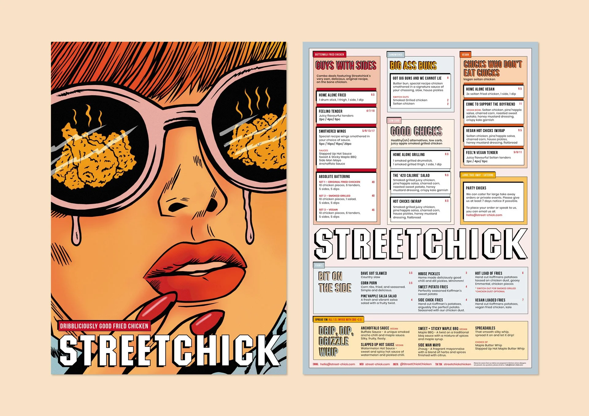
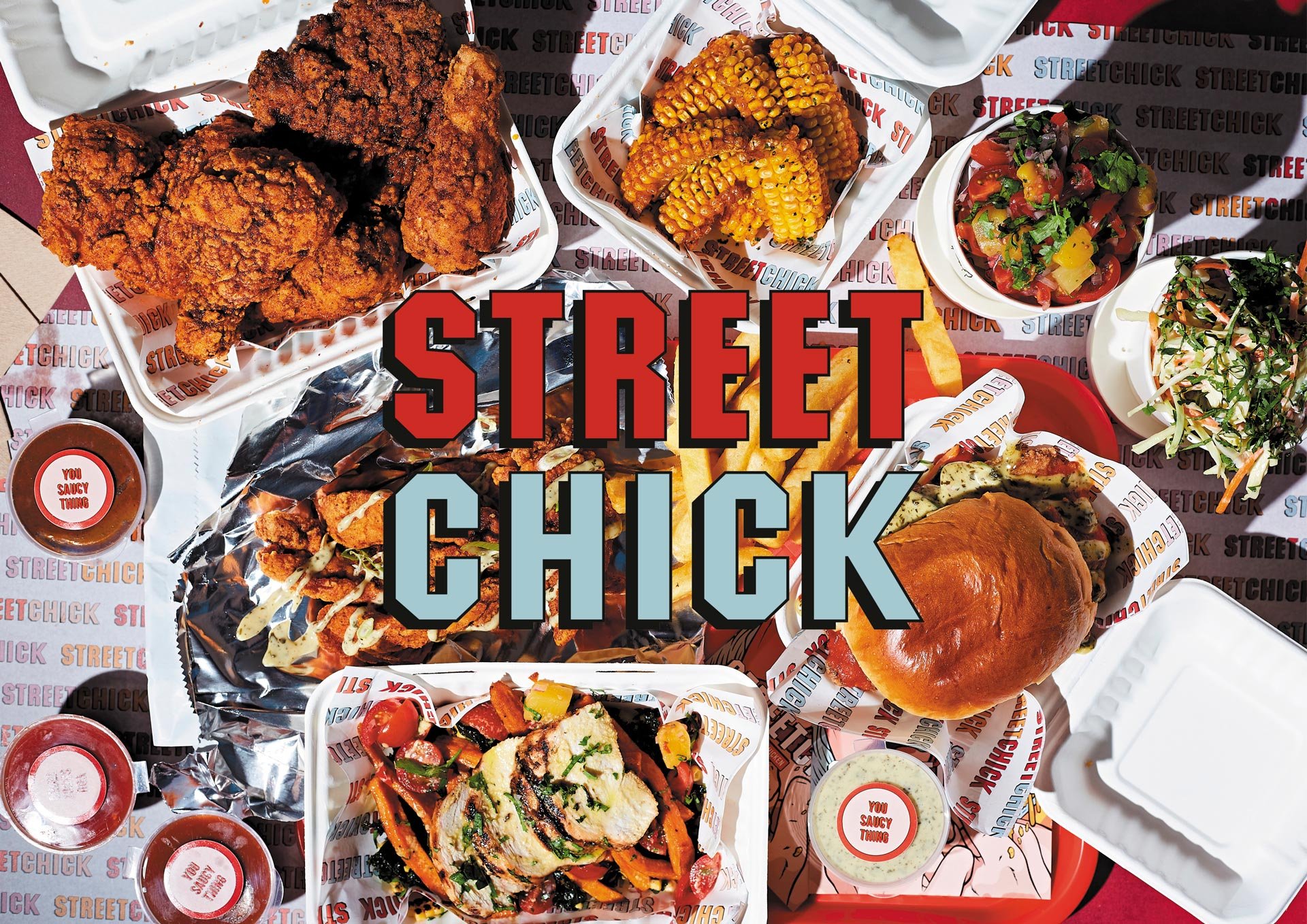
Dribbliciously Good Fried Chicken. Southern-style fried chicken with cool twists and major innuendo. Urban old-school diner meets American college retro.
Street Chick aims to disrupt an already saturated industry by offering a tongue-in-cheek, quirky and shock-factor concept. A health conscious ‘grab-and-go’ spot for everything fried chicken, offering authentic Southern-style cooking with major contemporary twists on old-school classics; along with healthy alternatives offering gluten-free options and vegan ranges – revolutionising fried chicken and promoting interesting and healthier eating through good quality produce.
We helped Street Chick on everything, from their brand identity right through to collateral and packaging. We initially worked with them to develop their unique tone of voice – an extremely tongue-in-cheek and risqué language, blending sexual innuendo and promiscuous terminology with feel-good chicken – which then formed the backbone of the brand identity. The branding and packaging is old-school classic diner, meets retro-American college, meets modern urban city. Illustrations provided by artist Loch Ness enhance a comic book style aesthetic adding to the retro feel and eye-grabbing appearance.


